Sunday 3 March 2024
Why do three adjacent villages have rare C17th fonts?
LAHS Member Bob Trubshaw examines three local examples of rare baptismal fonts found in the villages of Bottesford, Orston and Muston, exploring their links to Archbishop Laud's counter-reformation of the mid 17th Century.
How many seventeenth century fonts have you seen? No matter how many fonts you may have seen while 'church crawling' I’m willing to bet you’ve never seen more than one or two (but not realising that one of them isn't older). You may well have seen splendid fifteenth century ones, and admired the various impressive twelfth century ones – as well as any number carved between the twelfth and fifteenth centuries. But so far as I know there’s only eight fonts in the whole of England from the seventeenth century. And three of them are in adjoining villages straddling the Leicestershire-Nottinghamshire border. To be specific, Bottesford, Orston and Muston (pronounced locally as 'Musson').
So at one level this is very much local history. But the reason these fonts came into existence is very much part of national history at the time. And, indeed, the decoration on two of them is part of international history.
What do we know about these three fonts? The oldest one is at Muston, almost certainly the next oldest is at Bottesford, with the one at Orston following later.
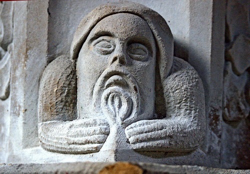
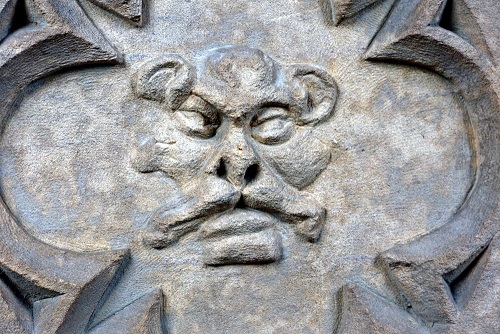
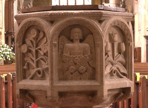
This blog would never have come about had Neil Fortey not emailed me in 2016 with photographs of Muston font with a little note to the effect that ‘something’s not quite right here’. The font has always been described as fifteenth century, even by experts such as Nicklaus Pevsner. And indeed it has the same overall shape. But looking at the faces reveals something that is most certainly not fifteenth century. Some of them have moustaches. And moustaches did not come into fashion until the seventeenth century. And all the faces at the bottom do not look like the Evangelists or other such decoration on fifteenth century fonts, but just like secular blokes or animals. And, compared to fifteenth century fonts, the figural decoration isn’t especially well carved.
Enter John Nichols. A very hard-working writer, printer and publisher living in London towards the end of the eighteenth century and, among much else, compiling a very comprehensive history of Leicestershire. And he included a very specific remark about the Muston font. ‘It was new in 1641.’ He doesn’t say that it was installed in 1641. Just that it was still considered new in 1641. Which means it was probably installed in the late 1630s.
I suspect the next-oldest of these three fonts is at Bottesford, a couple of miles north-west of Muston. Again my thanks to Neil Fortey for drawing my attention and taking these photographs. It’s the most splendid of the three. But then it would be because Bottesford church is the burial place of the Manners family, who were created Earls of Rutland in 1525 and subsequently became the Dukes of Rutland in 1703.
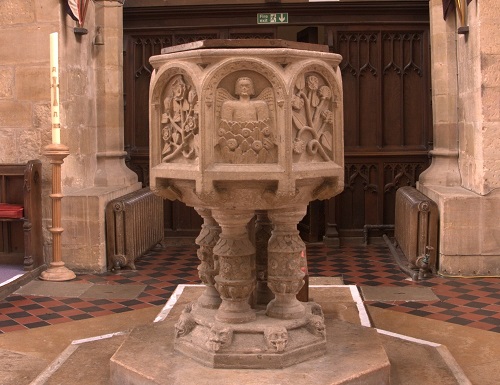
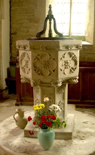
When we look at the font at Orston, which is just over a mile to the west of Bottesford but across the county boundary in Nottinghamshire, we spot several similarities and an inscription dated 1662. So I’m inclined to think that the Bottesford font is mid-seventeenth century.
The nearest of the five other seventeenth century fonts is at Tuxford, north Nottinghamshire, but I have been unable to access the inside of the church. The remaining four I know of are Byford (Herefordshire) 1638, Great Greenford (then Middlesex but now London) 1638, East Ham (then Essex but now London) 1639 and Rackheath Magna (Norfolk) 1639.
So, two from 1638 and two from 1639. What is it about the late 1630s? More helpfully specifically, who is it? Quite clearly this was the time when William Laud was Archbishop of Canterbury and instigating something of a counter-Reformation. Which created a brief countrywide spree of church restoration.
Born in 1573, William Laud rose through the ranks of the Church of England to be a bishop and then, in 1633, King Charles the First appointed him as Archbishop of Canterbury. Charles was keen to enforce uniformity of liturgical practices across the Church of England. This came to be known as Laudianism. The liturgy was often highly ritualistic and evolved into what is now usually referred to as ‘high church’.

Laud especially opposed Calvinism and Presbyterian approaches to running churches. Puritan clerics and laity regarded him as a formidable, indeed dangerous, opponent. Laud was especially loathed for prosecuting opponents in the Star Chamber court. This was regarded less as legal prosecution and more as religious persecution. Laud’s ideas and actions increasingly aggravated the Puritanical sects who were to become the Roundheads of the imminent civil war. Laud was arrested by Parliament in 1640, just seven years after he had been appointed Archbishop, and was executed at the start of 1645 when the First English Civil War was ending.
Despite a relatively brief time in post, Laud’s influence was substantial. For the previous hundred years the Reformation instigated by Henry the Eighth, and implemented by the likes of Thomas Cromwell, had been destroying religious imagery and even whole monasteries. There had been little, if any, maintenance of church buildings, and – apart from replacing altars with communion tables – little replacement of liturgical furnishings such as fonts. So by 1633 there was a lot of catching up to be done. And it was often more than patching up. Roof timbers were replaced, wooden bell frames reconstructed, elaborate font covers commissioned, and much else. Thankfully for historians it was the fashion of the time to inscribe prominent timbers with a date and, typically, the initials of the two churchwardens.
The interiors of late sixteenth century churches had been fairly plain. Iconoclasts had destroyed most of the decorative and devotional art. In their place pompous memorials to Elizabethan gentry began crowding out the chancel. And Bottesford is as good an example as any. The Laudian counter-reformation steadily brought to these austere interiors items of beauty and sanctity. And such items were most commonly associated with the two sacraments of the post-Reformation English church: eucharist and baptism.
Fonts have a special place within a church, either in front of the west door or to the west of the south door. They also have a special place in the minds of congregations. Generation after generation have been baptised there. While fonts were sometimes replaced more typically twelfth century and even Anglo-Saxon fonts have remained in use down the centuries.
Fonts with carvings of saints would have been damaged by mid-sixteenth century iconoclasts. This would most likely explain seventeenth century replacements. But even when the font did not need replacing it became the ‘done thing’ to adorn the existing font with a splendid spire-like font cover. This was ostensibly to protect the holy water in the font basin from dirt or profane use. But it of course make a dramatic statement close to the entrance to the church.
So the font at Muston would be very much part of this national campaign to spruce up parish churches. We can reasonably assume – though not prove – that Muston’s previous font incorporated images of saints so had been damaged, perhaps badly, during an episode of iconoclasm. Note that while Muston’s font has lots of faces, none of them are religious. So even if the sea-saw of religious sentiment moved away from Laudian pomp and circumstance then the font would not be smashed by iconoclastically-inclined zealots.
So when John Nichols informs us that Muston’s font was ‘new in 1641’ we can be sure that this was part of the Laudian revival of the previous decade. The same is true of Byford, Great Greenford, East Ham and Rackheath Magna – the four fonts known to have been installed in 1638 or 1639.
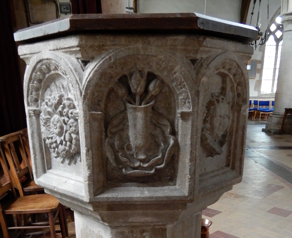
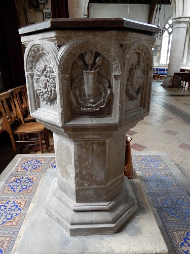
But what about Bottesford and Orston? We know the Orston one is dated 1662. And there are stylistic similarities between them. Notably both include a vase of tulips.
Tulip bulbs, along with other plants such as potatoes, peppers and tomatoes, came to Europe in the sixteenth century. The tulip was different from other flowers known to Europe at that time because of its intense saturated petal colour. As a result, tulips rapidly became a coveted luxury item and a profusion of varieties followed. Tulips retained their high-status until the beginning of the nineteenth century when the hyacinth replaced them as the most fashionable flower.
The presence of tulips on one of the panels on the Bottesford and Orston fonts would be consistent with any decade of the seventeenth century, and entirely in accord with the date of 1662 on the Orston font. What tulips symbolised to a seventeenth century Christian is unclear but we can reasonably assume they were intended to be for the ‘glory of God’, analogous to the ubiquitous displays of flowers in parish churches and non-conformist chapels throughout the country and indeed the world.
Plausibly Muston’s original font was broken during the Reformation and needed to be replaced. News would quickly reach Bottesford and we can imagine that the Earl of Rutland was a bit miffed that a nearby ‘lesser’ church had a better font. So, very much in the manner of keeping up with the Joneses, an even more elaborate one was commissioned for Bottesford. Orston’s rector – or one of the church’s benefactors – then commissioned the third font, perhaps in memory of a deceased relative.
However the Bottesford and Orston fonts are very unlikely to date to the 1640s or even 1650s. After Laud’s demise there was a renewed frenzy of Puritanical iconoclasm followed by the so-called Interregnum or Commonwealth of 1649 to 1660. It was not a sensible time to be commissioning fonts which expressed ‘high church’ sentiments.
My guess – and at this stage it can only be a guess – is that the Bottesford font was a ‘celebration’ of the Restoration of the Monarchy in 1660, with the Orston font having a similar origin.
Elaborate as these three fonts are, the decoration has not always been admired. In 1908 Francis Bond wrote:
… hanging would not be good enough for those who wrought the fonts of Tuxford and Bottesford.
Now this poses a problem. The font at Tuxford is octagonal but undecorated. There is however an exceptionally elaborate wooden font cover. I have not been able to verify a seventeenth century date for the Tuxford font, but a Charles Read was born in Tuxford in1604. He became wealthy and a prominent benefactor to the church so may have sponsored the font and cover before his death in 1669.
More Laudian Leicestershire?
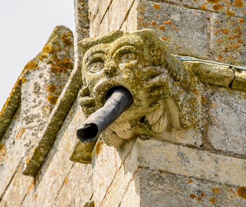
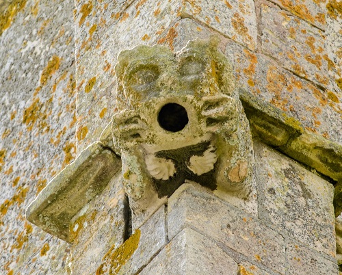
Are there any more carvings from the 1630s in Leicestershire? A definitive answer must await more investigation. But there is at least one other church with such carvings: Scalford (pronounced locally as 'Scorfud'), about twelve miles south-west of Muston. Pevsner states that the tower at Scalford was rebuilt in 1639. Which means that the gargoyles are probably from this time – although there is just a slim possibility they were reused from the older tower. But they seem to be a little too 'crisp' to be medieval. But are they really rare examples of 'Laudian gargoyles'? Much as it seems likely, further research is needed for confirmation.
Bob Trubshaw
Email: bobtrubs@indigogroup.co.uk
This article is based on a video published on Bob’s youtube channel which can be accessed here https://www.youtube.com/watch?v=eXy528G9y2o
Acknowledgements
My thanks to Neil Fortey for instigating this series of discoveries and to Martin Palmer for first alerting me to the implications of the Laudian Revival. Special thanks to Graham Parry, author of Glory, Laud and Honour, for generously sharing his views about the Muston font back in 2016.
Bottesford church is normally unlocked and well worth a visit for the stupendous collection of sepulchral effigies as well as the font. Muston church is normally locked but the key is available from the nearby tearoom. Orston church is also normally locked but I understand a key is available from the pub at the side of the churchyard.
Sources
Glory, Laud and Honour: The Arts of the Anglican Counter-Reformation, Graham Parry (Boydell 2008).
Fonts and Font Covers, Francis Bond (Henry Frowde 1908); online at archive.org/details/fontsandfontcov00chargoog
en.wikipedia.org/wiki/Duke_of_Rutland
en.wikipedia.org/wiki/Tulip_mania
en.wikipedia.org/wiki/Tuxford
en.wikipedia.org/wiki/William_Laud
Background image: Orston font with a vase of tulips. Photo provided by Bob Trubshaw
Orston font with a vase of tulips. Photo provided by Bob Trubshaw